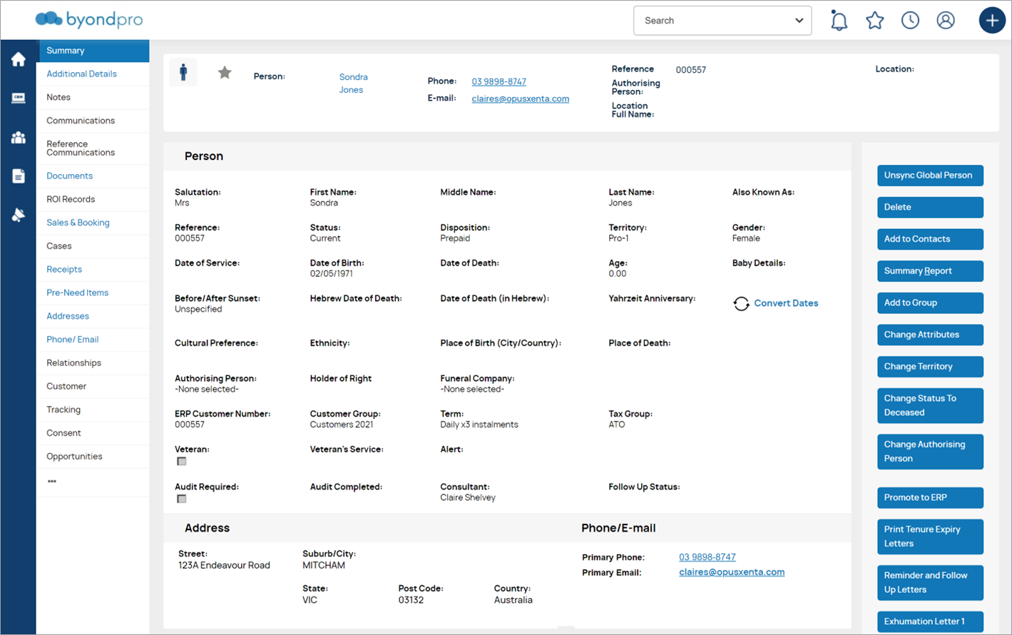
The byondpro user interface has been upgraded to a new modernised, crisper look and feel, incorporating new colour schemes, fonts and icons.
-
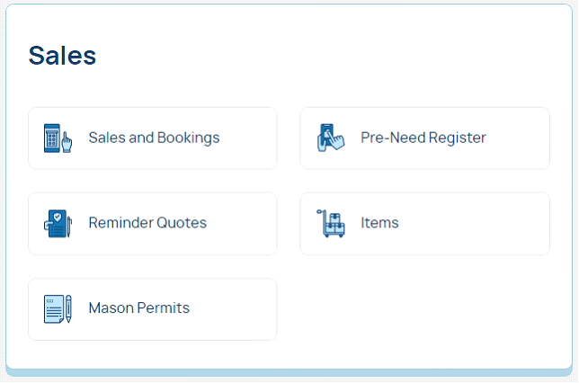
Modernized screen layouts, fonts and text sizes
-
Colour scheme & icons: standardised throughout
-
-
Navigation menus: moved from across the top to the left panel
-
includes the primary navigation for Home, My CRM and Team CRM, Reports & Marketing, and the related information tab headers for each module